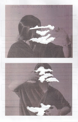
For my final emulation, I chose the black and white torn photograph from charmaineolivia.tumblr.com because it employs an interesting technique that I wanted to experiment with.
First, I created a photoshoot in which the model/subject was wearing similar clothing to the original photograph. I also positioned my model so that she was making the same gestures as the original as well as having the same sort of posture. I positioned the lighting so that her face was lit up in a similar way to the original then imported the image I wanted into photoshop. I changed it so that it was black and white and had a similar amount of contrast before printing it out and ripping the paper where the photo was ripped in the original. After that, I stuck it onto a plain piece of white paper and scanned the image back into the computer.
How to improve:
- Make the lighting more like the lighting in the original photo
- Create more contrast so that the model is more visible
- Use smaller rips to create a better result
- Make sure the photo prints onto plain paper so that no writing or black lines show through
Contact Sheet:
List of Possible Photographers to Interview
- Ella Ruth
- Annie Leibovitz
- Mario Testino
- Mark Seliger
- Greg Gorman
- Dan Winters
- David LaChapelle
- Jean-Baptiste Mondino
- Nathaniel Goldberg
- Peter Hapak
Possible Questions To Ask
- When taking your photographs, is there a particular progress you go through such as working on instinct or pre-planning your photographs through sketching what you want the composition to look like?
- Is there anything that influences your choice of colour scheme or lighting within your photographs? Do you plan specific colours and lighting before hand or experiment during the photoshoot?
- Some people describe your work as [comment from a relative, second-hand source - research needed here]. Would you agree with this statement? What would your response be?
- [Choose particular aesthetic feature within their photography] is a dominant and recurring feature in some of your photographs. Is this a deliberate element that connects to the themes and ideas that you wish to express within your work?
- What tips would you give to a photographer who was emulating your photographic techniques and processes?
- Has your work been inspired by any other photographers? Has your work been shaped by other things such as people in general, events or situations?
- On average, how long would it take you to create a piece that you are fully satisfied with?
- Do you ever experiment with other ways of producing your photographs? Are there any processes you'd like to experiment with in the future?
For my second emulation, I chose to emulate a photograph from imawoman.tumblr.com in black and white. I chose this photo in particular as it reflects self image and the way society perceives beauty which is an issue that people encounter frequently. I also chose it because black and white photos emphasise shape and form which is something that I want to employ within my photography work.
To create the writing upon the model's face, I used eyeliner to draw on everything and used the original photo as a reference so that the result in terms of the makeup was more accurate. I also decided to use clothing similar to the original photo so that the results would be closer to the image I was emulating. For this photoshoot, I chose to use the camera on my phone in order to experiment with the quality of the photograph as well as exploiting the zoom on the camera.
After I took a range of photographs (contact sheet below), I went through each photo and decided upon one with the best depth of field and had the model in a position similar to the model in the original picture. I used photoshop in order to change the levels so that the exposure was improved as well as changing the picture to black and white and then edited the contrast and brightness to bring out the shape and form of the shape like the original photograph does. Not only this, but the contrast made the hat darker which meant that it was a much more similar tone to the hat the model in the original image is wearing.
How to improve:
- Change positioning of lighting
- Stand further away from subject and use the zoom function on the camera to create similar framing to the original image
- Change the positioning of the face of the model
- Use a different camera e.g. DSLR camera
Contact Sheet:
Cam Rackam is an American artist and designer who creates a lot of gothic oil paintings, both commissioned and otherwise. He uses smooth brushstrokes in which the colours blend together to create a realistic image upon the congas. This also creates textures of skin in his portraits that look more aesthetically pleasing and allow him to experiment with the way light is displayed. The stark contrasts between light and dark emulate the lighting that would be used within photography and draw attention to the subject of the painting itself.
 The way I will incorporate this style into my photos is by using similar lighting conditions in order to create an effect like the chiaroscuro contrasts of light and dark that Rackam creates so successfully within his compositions. I will also use similar makeup to create the gothic look that the artist specialises in when they create portraits, both true to life and more abstract such as his portrait 'Fiction' in which the subject has been given a darker, more skeletal look as well as the cooler tones.
Because Rackam's work has both gothic and melancholic atmospheres, I will also use subjects/models and clothing that will bring the same sort of atmosphere and create the poignant mood that the artist integrates so well into his work.

The three photos have been created by using a shallow depth of field in order to capture the model/subject in each portrait and create a great amount of detail to both interest and attract the eye of the viewer.
A higher saturation has also been used to make the colours pop out of the photographs and catch the eye with bold tones. Not only this, but more muted colours have been used in the background as opposed to the foreground where there's more saturation on the model/subject.
Colour has been carefully considered in these photographs. Earthy colours in the picture in the top left have been used in a way that makes the colour of the eye stand out and strike the viewer in a way that catches the attention almost immediately and draws the eye to the centre of the composition.
 The image on the left has a strong contrast of cool and warm colours that make the subject bold. The golds and reds are saturated more than the background so that we are immediately drawn to the subject rather than the background. Not only this, but the colours stand out against the skin and the plain grey/white clothing which makes the image more intriguing.
 The photograph on the bottom right uses a more muted colour palette, the purples and oranges standing out against the grey and green on the shirt. The colours of the clothing stand out against the grey background which makes you want to look at the subject. Eyeliner has been used around the eyes in order to draw attention to them and the contrast created by the lighting makes the pale skin and dark hair contrast in an aesthetically pleasing way.
I will integrate these elements into my photos by using colourful clothing and different apertures in order to make the model/subject stand out. I will also consider lighting and experiment with it in order to create the contrast in colour and tone within the composition of the photograph. Not only this, but I will also find ways to draw attention to certain parts of the face, such as the eye, by using makeup or colour to bring out the eye colour of the subject/model.


