Tuesday, 30 June 2015

Focus and Free Lens

What is Focus?

Focus is how clear a photo, or part of a photo, is due to the depth of field due to a change in aperture on the camera when a photo is taken. A shallow depth of field is created with an aperture of 4.5 or 1.8 whereas a wider depth of field is created with a higher aperture like 7.5 or 9.6. These can be used to create different moods and interesting areas of focus within the composition of a photograph. 
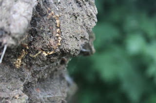

For these examples of focus in photography, I went out into the Lowe School playground and changed the aperture so that there was a low depth of field. I then imported the photos into photoshop and used the blur effect to blur the background further, therefore emphasising the parts of the photo that are focussed and making the composition more aesthetically pleasing for the viewer. 
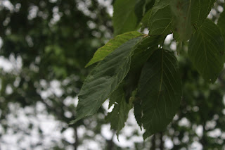


I like this photo I edited the most as blurring the background further made it look much more interesting and created almost like a bokeh effect with the light contrasting with the darker green tones of the blurred leaves. It is a very appealing photo with a lot of visual appeal and the composition takes advantage of space as well as focus. 


What is Free Lens?

Free lens is a technique where you remove the lens from the camera in order to create more contrast between blurred and focussed elements of a photo as well as visual interest within the composition. Because the lens is detached from the camera, you can move it to different places within the frame of the composition and get more interesting compositions to look at. 


For these examples of free lensing photos I took, I tried positioning the edge of the lens inside the frame to create interesting effects. I like the first one the most as there is more focus nearer the edge of the composition, creating a more intriguing and aesthetically pleasing photo. I also like the fact that the lens graduates a little into the photo as it almost creates the illusion that it has been taken on the ground or that someone is looking up a little whilst laying on their side on the ground. 


I also like the second photo as the top left corner looks slightly more focussed than the rest of the photo which looks unusual and interesting. The leaves nearer the bottom right corner are more blurred and creates almost like a bokeh effect. However, the composition is mostly blurred so it doesn't look as visually pleasing as the first photo.


Thursday, 25 June 2015

Andreas Gursky

Basic Information and Photograph Analysis

Andreas Gursky is a German photographer who was born in 1955. Gursky uses photography to capture landscapes, people, industries and architecture in great detail which creates photos with a high depth of field and clarity. He uses an elevated perspective on a large scale to show individual detail such as items in a supermarket or windows on a large building. Gursky's work is highly influenced by his schooling under photographers Bernd and Hilla Becher.
Centre Georges Pompidou, Andreas Gursky

Through digital manipulation, Gursky heightens the scale, detail and colour within the composition of his photographs and he holds the world record for the highest priced photograph in 2011 which was his photo from the series entitled "Rhein". 

Gursky first exhibited his work in 1985 in Germany and has proceeded to do exhibit his work throughout Europe since then. He shares a studio with fellow photographers Laurenz Berges, Thomas Ruff and Axel Hutte in Germany and has become a renowned photographer whose work can sell for millions of dollars in auction. 


Rhein II, Andreas Gursky 1999
This photograph from the series of photos entitled "Rhein" sold in auction for $4.3million. This photograph breaks the rules of photography due to the fact that the composition is split into halves rather than the conventional thirds that is generally used within photography. It is somewhat resemblant of a contemporary fine art painting because of the sectioning of colours and the use of completely straight lines which wouldn't usually be found in unedited photos. There isn't anything particularly aesthetically pleasing about this piece as there isn't very much there in terms of composition. This piece aims to make the viewer question whether it is fine art or reality due to the fact that it isn't an actual place and it has been edited to make the lines as straight as possible and everything except the sky has been removed from the background to make it more symmetrical. 


99 cent, Andreas Gursky 2001
This photo is part of the 99 cent II diptychon and sold in auction for $3.3million. This photograph uses a wide range of colour and has a high depth of field which is evident by the amount of detail in the items that are stacked on the shelves in the photo. The composition has more interest and is more aesthetically appealing as it has a wider variety of colours that contrast and compliment each other to draw in the person viewing it. The straight lines and sectioning within the composition are typical features of Gursky's work which is what makes his photos so identifiable. The composition of this photo is also broken up slightly by the people who are in the photograph browsing the shelves. 


My Gursky Photos


 As an experiment, I decided to emulate Gursky's work. I went outside to the Lowe School playground and took photos of places that had plenty of lines and little going on in them so that they would look more like Gursky photos. I then imported them into photoshop and began to edit them by using the warp tool in order to create straighter lines and therefore more Gursky-esque. 

Because some of Gursky's photos have a lot of colour, I also used the saturation tool to make the colours stand out more, therefore creating more visual interest within the composition and making them aesthetically pleasing. I changed the contrast too so that the colours were brought out more and the details were more noticeable, just like Gursky's photos. 

For the emulation on the left, I cloned parts of the sky and lined them up so that the houses in the background weren't noticeable. I also cloned part of the roof in the background to cover parts of the hedge that were sticking up which made it look more symmetrical. I then cloned other elements like the grass and the door and placed them so that the image was more like a gursky photo than my own.